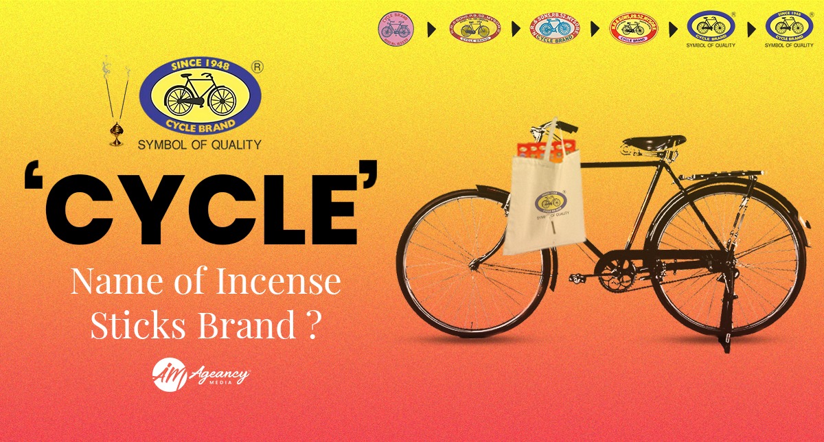
How did they come up with this name for the Incense Sticks Brand?
Table of Contents
ToggleHey brand folks,
Welcome to the first brand brief article by Ageancy Media.
Where we will deep dive into some of the famous brands and will try to understand their brand story from scratch.
Why ‘CYCLE’ ?
Mr. N. Ranga Rao ( Founder of NR Group – ‘CYCLE’ flagship brand registered under it ).
He started making incense sticks early in 1948.
Rao chose the name “CYCLE” in 1950 because at that time the cycle represented freedom, affordability, and aspiration. Cycle was the only vehicle which was affordable for every range of people. CYCLE represents availability, consumer touch with everyday life.
What also helped was the fact that a cycle was called a cycle in every language in India.
How did ‘CYCLE’ start ?
N Ranga Rao, a member of a village in the Madurai district, started the business in 1948. He began by making Agarbathies at home with his grandmother’s help.
Rao’s wife pawned her jewelry to provide the initial capital.
The game of packaging -
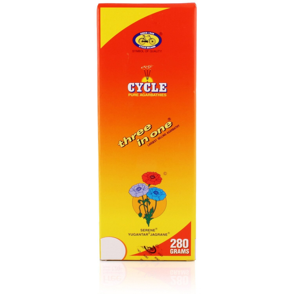
Interestingly, in the 50s, most of the incense sticks products were packaged in tin metal boxes. Ranga points out that the brand was the first mover in the category to transition from a metallised box to a duplex board packaging. “ We were one of the first brands to also introduce lamination.” Ranga reveals, “My dad actually went to local design schools and recruited artists on internships to design packaging for us. Today we have a very robust in-house team that creates all our packaging, but also all our art for social media.”

Tagline and Colors symbolize inclusivity of all -
“Everyone has a reason to pray" and "Bhagwaan Hai".
This tagline showcases inclusivity of all consumer types who resonate with incense sticks and praying methods.
Core Colors:
Golden, Yellow, Blue, Orange, Maroon, White, Green.
The color choices for Cycle Agarbatti are carefully selected to evoke specific emotions and associations in consumers. The warm, earthy tones create a sense of comfort, tradition, and spirituality, while the brighter colors add a touch of vibrancy and modernity.
Overall, the Cycle Agarbatti brand color story is a blend of tradition and modernity, reflecting the brand’s heritage, values, and aspirations.
It creates a strong visual identity that resonates with consumers and reinforces the brand’s position as a trusted and respected name in the Indian agarbatti market.
As a leading agency in marketing, we always suggest our clients take that risk- It can be breaking the packaging stereotypes of the industry or maybe a simple thought can be your tagline and keep with online trends. As the entire brand story of ‘CYCLE’ shows us the importance of thinking out of the box and keeping up with the trends is a challenging part to run a long lasting business.

‘YOUR PRESENCE NEEDED EVERYWHERE YOUR AUDIENCE IS PRESENT.’
So here’s our wrap up for ‘CYCLE’ – Behind the story behind its name, legacy and much more. See you on the next topic.


